---
theme: ../../packages/theme
title: Design System Showcase
author: Erwann
colorSchema: dark
highlight: one-dark-pro
section: Design System Showcase
description: The communication problem that led to a design system showcase — and how it gives every role a shared reference
favicon: /favicon.svg
layout: cover
---

# Design System Showcase

When everyone speaks the same language.

-- Erwann

---

## We already have this — on web

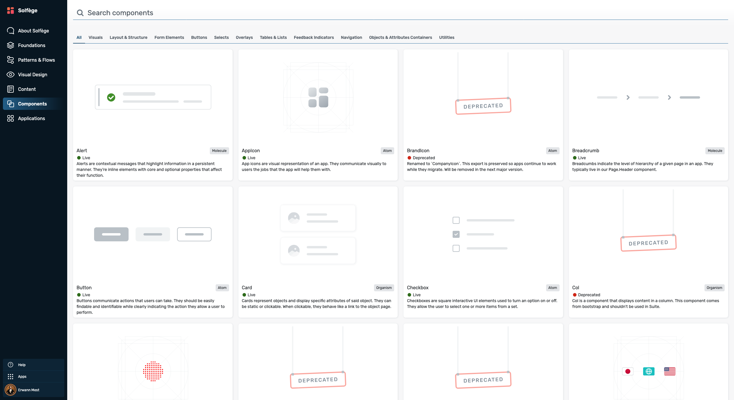
The PDEGO web teams have **Solfège** — a full design system documentation site with component gallery, props tables, and usage guidelines.

<div style="display:flex;gap:32px;align-items:stretch;margin-top:12px">
<div style="flex:1;display:flex;flex-direction:column;gap:12px">

<v-click><KeyValue :items="[{ key: '🌐 Web — Solfège', value: '<strong>React + react-bootstrap.</strong> Every component documented, searchable, accessible to the whole team at <a href=&quot;https://solfege.theorchard.com/components&quot; target=&quot;_blank&quot;>solfege.theorchard.com/components</a>.' }]" /></v-click>
<v-click><KeyValue :items="[{ key: '📱 Mobile', value: '<strong>React Native.</strong> Same React paradigm — but components render to <strong>native primitives</strong>, not HTML. Solfège does not apply.' }]" /></v-click>

<v-click>
<Callout type="warning" title="The gap">
Mobile has a design system in code — but <strong>no equivalent of Solfège</strong>. No gallery, no reference, nothing the whole team can simply open.
</Callout>
</v-click>

</div>
<div style="flex:1;display:flex;align-items:center">
  <img src="./solfege-components.png" style="width:100%;border-radius:8px;border:1px solid rgba(255,255,255,0.1);box-shadow:0 4px 24px rgba(0,0,0,0.4)" />
</div>
</div>

---
layout: section
---

# Why a Design System Matters

---

## A shared vocabulary for the whole team

<div style="display:flex;flex-direction:column;margin-top:16px">
<v-click><Timeline :compact="true" :items="[{ title: '⚡ Velocity', description: 'Don\'t reinvent the wheel — if a component exists, use it. No rebuilding, no debating.' }]" /></v-click>
<v-click><Timeline :compact="true" :items="[{ title: '💬 Guidance', description: 'Pre-answers recurring questions: which component, what spacing, how to handle edge cases.' }]" /></v-click>
<v-click><Timeline :compact="true" :items="[{ title: '🎯 Consistency', description: 'Every screen built by different teams still feels like one product.' }]" /></v-click>
<v-click><Timeline :compact="true" :items="[{ title: '✅ Quality by default', description: 'Accessibility and edge cases solved once in the component — not reinvented per feature.' }]" /></v-click>
</div>

---
layout: section
---

# The Solution for the Mobile Team

---

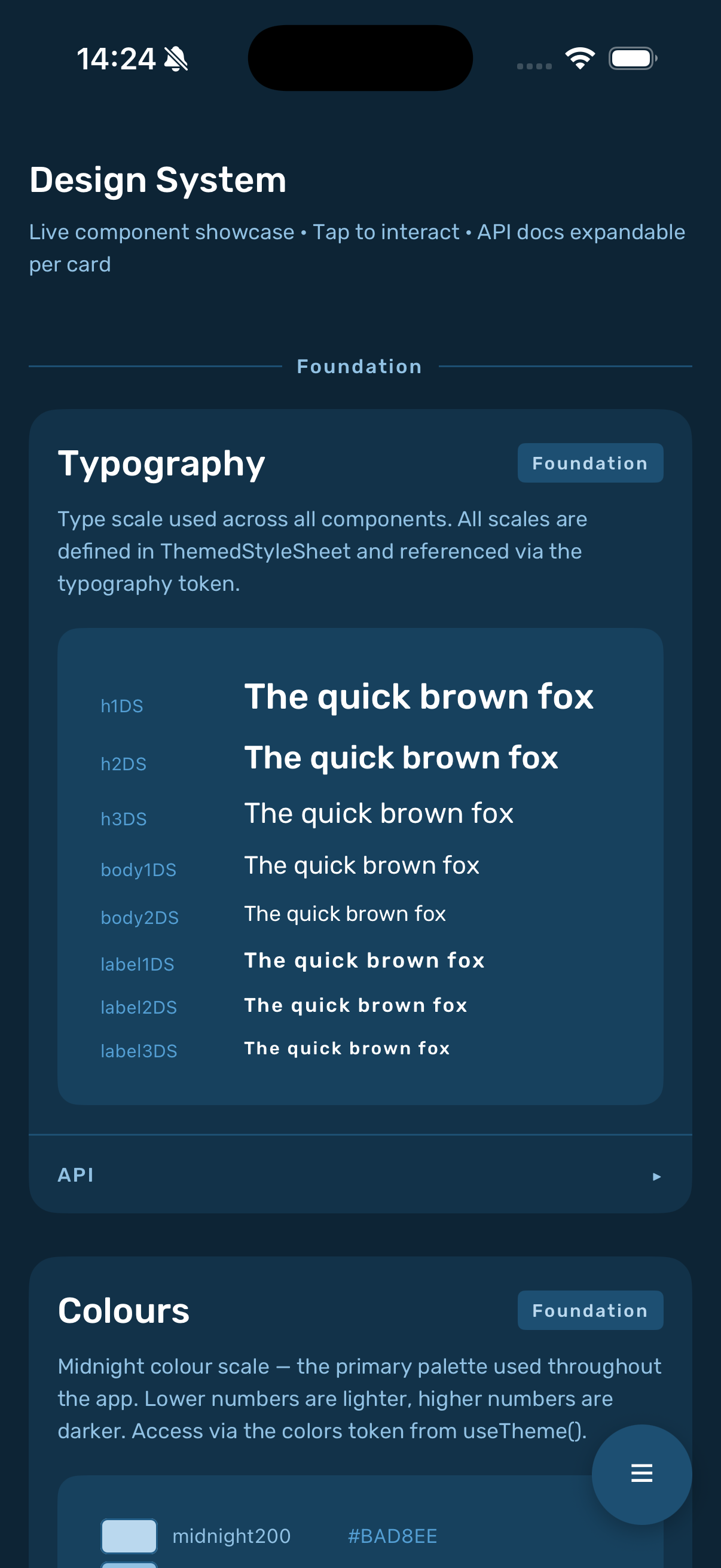
## The Design System Showcase

<div style="display:flex;gap:32px;align-items:center;margin-top:8px">
<div style="flex:1.4;display:flex;flex-direction:column">
<v-click><Timeline :compact="true" :items="[{ title: '📋 One registry', description: 'Every component registered once in <code>componentsRegistry.tsx</code> — single source of truth.' }]" /></v-click>
<v-click><Timeline :compact="true" :items="[{ title: '📱 Live components', description: 'Not screenshots — the real components, running in the real app.' }]" /></v-click>
<v-click><Timeline :compact="true" :items="[{ title: '🎮 Interactive', description: 'Tap, scroll, trigger states — no feature needed, no device handoff.' }]" /></v-click>
<v-click><Timeline :compact="true" :items="[{ title: '🔍 Component index', description: 'A floating button that expands into a full index — jump to any component instantly.' }]" /></v-click>
<v-click><Timeline :compact="true" :items="[{ title: '🔬 Test in isolation', description: 'Sign off as soon as dev is done — without waiting for the feature to ship.' }]" /></v-click>
</div>
<div style="flex:0.6;display:flex;justify-content:center">
  <img src="./showcase-screenshot.png" style="height:340px;border-radius:32px;border:1px solid rgba(255,255,255,0.1);box-shadow:0 4px 32px rgba(0,0,0,0.5)" />
</div>
</div>

---

## For every role — what changes

<div style="position:relative;height:320px;margin-top:12px">
  <svg style="position:absolute;inset:0;width:100%;height:100%;pointer-events:none" xmlns="http://www.w3.org/2000/svg">
    <line x1="50%" y1="50%" x2="14%" y2="11%" stroke="rgba(16,185,129,0.4)" stroke-width="1.5" stroke-dasharray="5 4"/>
    <line x1="50%" y1="50%" x2="86%" y2="11%" stroke="rgba(16,185,129,0.4)" stroke-width="1.5" stroke-dasharray="5 4"/>
    <line x1="50%" y1="50%" x2="14%" y2="89%" stroke="rgba(16,185,129,0.4)" stroke-width="1.5" stroke-dasharray="5 4"/>
    <line x1="50%" y1="50%" x2="86%" y2="89%" stroke="rgba(16,185,129,0.4)" stroke-width="1.5" stroke-dasharray="5 4"/>
  </svg>

  <div style="position:absolute;top:50%;left:50%;transform:translate(-50%,-50%);padding:10px 20px;background:#0d2620;border:2px solid rgba(16,185,129,0.5);border-radius:99px;font-size:12px;font-weight:700;color:#10b981;text-align:center;white-space:nowrap">
    Design System Showcase
  </div>

  <v-click><div style="position:absolute;top:0;left:0;width:195px;padding:12px 14px;background:#0d2620;border:1px solid rgba(16,185,129,0.25);border-radius:8px">
    <div style="font-size:13px;font-weight:700;color:#10b981;margin-bottom:4px">🎨 Designer</div>
    <div style="font-size:11px;opacity:0.75;line-height:1.4">Verify implementation matches design — directly in the app, without back-and-forth with engineers.</div>
  </div></v-click>

  <v-click><div style="position:absolute;top:0;right:0;width:195px;padding:12px 14px;background:#0d2620;border:1px solid rgba(16,185,129,0.25);border-radius:8px">
    <div style="font-size:13px;font-weight:700;color:#10b981;margin-bottom:4px">📋 Product Manager</div>
    <div style="font-size:11px;opacity:0.75;line-height:1.4">Reference live components in specs and discussions.</div>
  </div></v-click>

  <v-click><div style="position:absolute;bottom:0;left:0;width:195px;padding:12px 14px;background:#0d2620;border:1px solid rgba(16,185,129,0.25);border-radius:8px">
    <div style="font-size:13px;font-weight:700;color:#10b981;margin-bottom:4px">👨‍💻 Engineer</div>
    <div style="font-size:11px;opacity:0.75;line-height:1.4">Discover what exists, read props, copy snippets — one place instead of digging through source files.</div>
  </div></v-click>

  <v-click><div style="position:absolute;bottom:0;right:0;width:195px;padding:12px 14px;background:#0d2620;border:1px solid rgba(16,185,129,0.25);border-radius:8px">
    <div style="font-size:13px;font-weight:700;color:#10b981;margin-bottom:4px">🧪 QA</div>
    <div style="font-size:11px;opacity:0.75;line-height:1.4">Sign off in isolation — no need to wait for the feature to ship.</div>
  </div></v-click>
</div>

---
layout: section
---

# Demo

<div style="position:absolute;top:0;right:0;bottom:0;width:55%;display:flex;align-items:center;padding:24px">
  <img src="./demo-highfive.png" style="width:100%;border-radius:12px;box-shadow:0 4px 24px rgba(0,0,0,0.4)" />
</div>

---

## What Could We Do Next?

<div style="display:flex;flex-direction:column;margin-top:16px">
<v-click><Timeline :compact="true" :items="[{ title: '⚛️ React Native for Web', description: 'Render RN components in a browser — a live documentation site, no device required.' }]" /></v-click>
<v-click><Timeline :compact="true" :items="[{ title: '📖 Storybook', description: 'Industry-standard component docs — the mobile equivalent of what Solfège does for web.' }]" /></v-click>
</div>

---
layout: cover
---

# That's it!

<div style="max-width:80%">

One language. Everyone speaks it.

Add a component once — designers, engineers, PM, and QA all see it.

-- Erwann
</div>

<div style="position:absolute;top:0;right:0;bottom:0;width:45%;display:flex;align-items:center;padding:24px">
  <video src="./celebration.mp4" autoplay loop muted playsinline style="width:100%;border-radius:12px;box-shadow:0 4px 24px rgba(0,0,0,0.4)" />
</div>